- Every Journey Needs A Guide
- (971) 865-5158
How Hotjar revealed a major anomaly in our Google Analytics data

Cannabis in the News
August 1, 2018
Twitter Marketing in the Cannabis Industry
August 29, 2018How accurate is your Google Analytics Data?
As a content strategist, I love diving into Google Analytics. Reams of data, charts, graphs, and statistics make me feel like I’m really getting insight into user behavior.
How many organic views did my new page get? 100 in a day? Great. I’m killing it.
Is my strategy funneling users to sales pages? Behavior flow says yes. Nice one, me.
Did I increase time on page for critical landing pages? You be…wait a minute. What?
It started with a simple discrepancy. The time on page for one client’s landing pages was 300% greater than anyone else. My first reaction was shock. Oh my. Then excitement. Had I discovered the perfect landing page? Finally, my common sense kicked in. How, what, and most importantly, why?
Was this it? Did I find the silver bullet?
Avg. landing pages
Silver bullet landing pages
The page layout wasn’t typical. The client wanted a map front and center and all of my precious content was hidden behind an accordion menu on the lower left third of the page.
I wondered if my titles had really captured my audience, but doubts were already creeping in. These weren’t in-depth informational pages. No one was coming here to read about the client’s proximity to the local airport and city parks.
Nearly the entire page was above the fold. So what other elements could they be looking at? I went down the list of usual suspects.
What were users looking at?
- The image slider: Three pictures of the shop. Nothing to stare at.
- The map: Draggable. Click on details for a Google map. Standard fare.
- The content: Accordioned. Outbound local links. Not exactly gripping.
- The menu: Clickable. Opens in a new window. Move along.
When in doubt, get help.
I’d recently had the pleasure of meeting our Alaska-living developer and UX Analytics expert, Courtney Moses. If anyone could shed insight into what was happening, it would be her. My hypothesis? I’ve done something incredible—I just don’t know what it is yet.
H otjar UX Analytics provides heat maps, click maps, and live recordings.
We recently installed Hotjar, and I wanted to know how long I would have to wait for results.
You have to watch a pretty large number of user sessions to get a better feel for what the heat map is really saying.
Courtney Moses - Developer | Sherpa
If there’s one thing a content strategist knows how to do—it’s waiting for results. Just a few short weeks later and I had enough data for a dive.
Let the UX analysis begin.
Heatmaps didn’t reveal anything spectacular. Desktop users didn’t start dropping off until below the fold, and even then, they’d already looked at the most important parts of the page.
![]()
Mobile users dropped off much sooner, but that wasn’t a cause for alarm.
There had to be something I was missing. I hoped clickmaps would shine some light where heatmaps couldn’t.
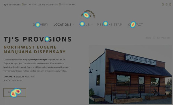
A bright red clickpoint lit the way to enlightenment. Desktop and mobile users clicked the Menu button more than anywhere else on the page. I had a lead.


But what was the one difference between the product menu on this website and the other dispensaries we work with? The product menu didn’t just open in a new window; it took users off-site.
The big reveal!
Live recordings; the one thing I hadn’t wanted to watch. There’s something voyeuristic about viewing a user’s actions online. They may be nothing but a data set, but damn it, there’s a person behind that scroll and click. I looked at the recording time stamps. 2:01, 2:48, 3:45. How much time were users actually spending on the landing page?
My answer? Roughly 75 seconds. Mobile users left the original page open, scrolling through the off-site product menu for anywhere from a minute to 20 minutes. Every single minute they spent offsite was another minute Google Analytics thought they had never left the page at all.
The big takeaway
Google Analytics isn’t the end all be all of data analysis. We use a range of seo tools to help our clients succeed. You can’t filter out outbound clicks, but you can track them using events. Understanding the impact a site setup can have on analytics data can help you track user behavior correctly. I’ve changed my behavior. Now if I could just find that silver bullet…
If you’re new to the cannabis industry and need a great place to start, I’ve written a beginner’s guide to cannabis marketing to get you going.


