Cannabliss & Co.
Our first client
In early 2016, we met Cannabliss & Co. and were asked to design some print materials for upcoming events. We soon found ourselves developing a brand identity around their logo, and building them a new website. Over the years, we have done a lot of diverse work for them including search engine optimization, dispensary design, social media management, billboard/print ads, and apparel design. Since we have started working with them, they have grown from two to five stores with a 6th set to open this year.
Brand identity
color palettes & font choices
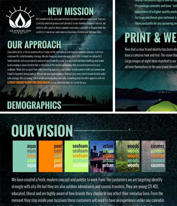
When we first started working with Cannabliss, they were off to a great start. As Portland's first medical dispensary, they were already well-known by most of the medical community in Portland. Although their logo was clean, modern, and functional, they needed branding guidelines to back it up.
After speaking extensively with their owner, we began to build an identity around their mark. We started by selecting a set of strong print and web fonts, developing a tagline, selecting a color palette that was strong and vibrant, and choosing imagery that spoke to the outdoors lifestyle that many Oregonions cherish.
This gave us a great foundation for the
dispensary website design work that followed.
A tagline is born
"Stay Blissed"
Working together with Cannabliss & Co., we created a tagline that was fun, catchy and memorable.
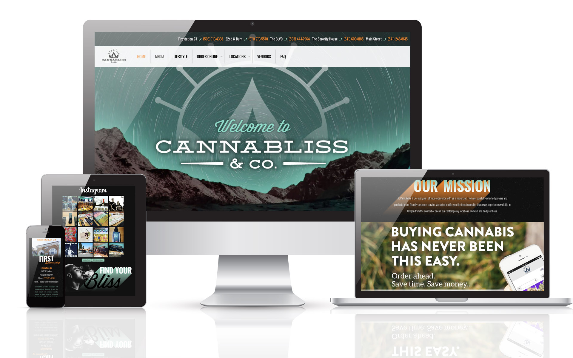
Web Design
that tells a story
Once the branding guidelines were in place, we set out to build their new site. From a design perspective, we wanted the website to be image-forward with the photos we selected, and invoke a feeling with the palette. A principle that we adhere to when working in this industry is to utilize color palettes that are far from the overused greens and yellows. This palette sets Cannabliss & Co. apart from their competition by using memorable "pop colors" on simple white and black canvas.


Creative Direction
for print, packaging & apparel
After completing the website in May 2016, we were asked to come up with a number of concepts for print, packaging, and apparel. We designed custom print menus, a few dope shirt designs, and billboard concepts.
We also designed some fun emojis based on the logo that we used as feeling descriptors for their product on the shelves, jar labels, and recyclable packaging.


Dispensary Design
that sticks with customers
Cannabliss & Co. tells a story of soaring mountains in the high desert of Oregon. Using that concept, we painted 5 murals inside their dispensaries all over the state that have made Cannabliss & Co.'s dispensaries iconic and memorable. We still meet people regularly who ask "who painted the inside of the Firestation?" .